


Have you ever clicked on a site that took too long to load? You probably didn't wait around. Now, imagine your customers doing the same. If your website isn't optimized for mobile, that's exactly what's happening.
Mobile optimization is about speed, usability, and seamless navigation. A slow checkout page can cost an e-commerce store thousands in lost sales. A poorly designed blog can drive readers away.
That said, if your site doesn’t work well on mobile, you’re losing traffic, conversions, and revenue.
- What Is Mobile Optimization?
- Optimizing Performance
- Writing Mobile-Friendly Content
- Optimizing Visual Content
- Optimizing Video Content
- Enhancing Performance with Core Web Vitals
- Enhancing User Experience
- Implementing Must-Have Security Practices
- Optimizing Mobile SEO
- Enhancing Voice Search and Local SEO
- Utilizing Google’s Tools
- Avoiding Pop-Ups
- Optimizing Button Size and Placement
- Ensuring Emails Are Mobile-Friendly
- Ensuring Seamless Cross-Device Compatibility
- Optimizing for Social Media Engagement
- Enhancing Website Accessibility
- Implementing Mobile-Optimized Forms
- The Future of Mobile Optimization: What’s Coming and What Actually Matters
- Mobile Optimization Best Practices for 2025: A Skimmable Guide
- FAQs
This blog will explain the best mobile optimization practices, why they matter, and how to apply them. Stay tuned for a bonus tip at the end!
Let’s start by understanding what mobile optimization is.
What Is Mobile Optimization?
“It’s the process of ensuring your website works flawlessly on smartphones and tablets. It’s about making sure users can browse, shop, and engage without friction.”
Why Does Mobile Optimization Matter?
Let’s look at the numbers that stress the importance of mobile optimization best practices.
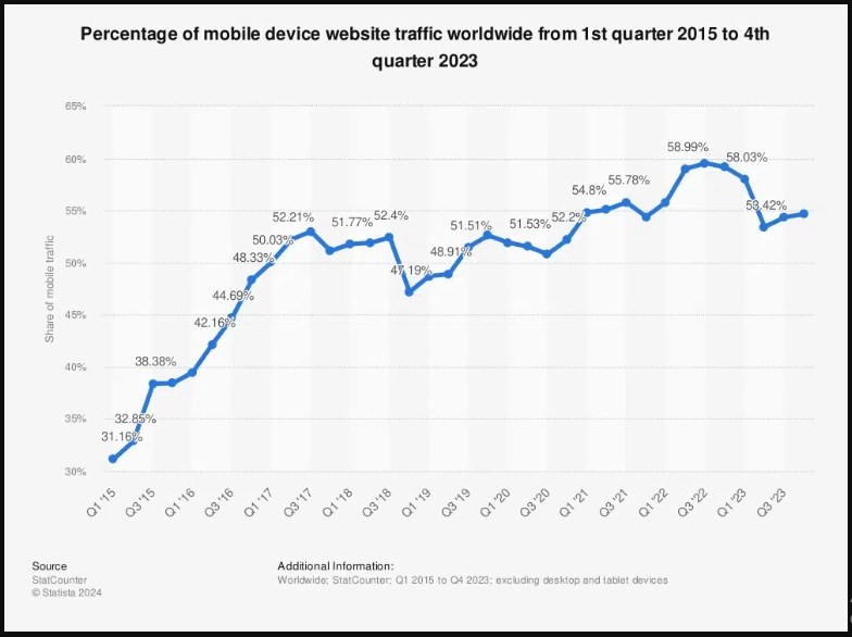
- More than half of web traffic (60%) comes from mobile. If your site isn’t ready, you’re ignoring most of your audience.
- Users expect speed. 53% will leave if a page takes over three seconds to load.
- Google ranks mobile-friendly sites higher. Mobile-first indexing means if your site isn’t optimized, you’re invisible in search results.
- Better experience = higher conversions. A well-optimized mobile site can increase the likelihood of purchases by 67%.
Simply put, mobile isn’t just part of the web; it is the web. If your site isn’t built for it, you’re already falling behind. But don’t worry about how to make it happen.
We’ve outlined 17 mobile optimization best practices for 2025 to help you succeed. Let’s get started.
1. Optimizing Performance
Performance optimization ensures that a mobile website loads quickly and runs efficiently. A mobile optimized site delivers content faster by reducing unnecessary elements, compressing assets, and improving how data loads.
Why It Matters
Mobile users expect instant access to information. A lagging site leads to higher abandonment rates and lower engagement. Search engines also prioritize fast-loading sites, meaning performance directly impacts visibility.
Without performance optimization, even well-designed sites struggle to retain visitors and convert traffic into revenue.
Let’s explore ways to optimize website performance.
How to Optimize
Here’s how to keep things fast and efficient.
- Eliminate unnecessary plugins, tracking scripts, and widgets. Keep only those essential for core functionality to prevent slowdowns.
- Store static elements like images, stylesheets, and scripts on users' devices. This prevents repeated downloads, speeds up return visits, and reduces server load.
- Avoid bottlenecks caused by excessive tracking codes. Use Google Tag Manager to organize and control script loading efficiently.
- Encrypt all data transfers to protect user privacy and prevent security breaches. Activate HTTP/2 to speed up loading by handling multiple requests at once.
If you want to know the best mobile optimization plugin WordPress, read this blog 10 Best WordPress AI Plugins to Boost Your Website in 2025.
2. Writing Mobile-Friendly Content
Mobile-friendly content ensures that information remains clear, concise, and easy to consume on smaller screens. This requires simple language, well-structured formatting, and typography that enhances readability.
Users interact with mobile content differently than they do on desktops. They multitask, scroll quickly, and expect immediate value.
Why It Matters
Reading on a mobile device is not the same as reading on a larger screen. Users demand direct and easy-to-digest information. Complex paragraphs can overwhelm readers, leading to higher bounce rates.
Structuring content effectively improves engagement and ensures that users stay on the page longer.
Let’s see how to write content optimized for mobile.
How to Optimize
To make content more accessible and engaging for mobile users, apply the following mobile optimization best practices:
Optimize Typography for Readability
- Use a minimum font size of 16px for body text.
- Maintain a 1.5x line-height to improve legibility.
- Choose web-safe fonts or reliable font services for consistency.
- Establish a consistent typographic scale across all elements.
- Limit the color palette to 2-5 primary colors to ensure proper contrast ratios for accessibility.
Make Content Easy to Scan
- Break text into short paragraphs to improve readability.
- Utilize bullet points to highlight key information.
- Apply subheadings, bold text, and highlights to aid navigation.
Enhance Call-to-Action (CTA) Elements
- Use clear and prominent buttons that encourage users to take action.
- Ensure CTA buttons are large enough for touch interactions without accidental clicks.
3. Optimizing Visual Content
Images and graphics play an important role in mobile experiences. However, poorly optimized visuals can slow down load times and disrupt user experience. Ensuring images load efficiently while maintaining quality is key to smooth mobile performance.
Why It Matters
High-resolution images can consume bandwidth, causing delays. Since mobile users expect fast and smooth browsing, unoptimized visuals can lead to frustration and increased page abandonment rates.
Implementing modern image formats and efficient loading techniques enhances both user experience and search rankings.
Let’s explore ways to optimize visual content for mobile.
How to Optimize
To ensure images and graphics do not hinder performance, consider the following strategies:
- Convert images to WebP or AVIF formats for superior compression without loss of quality.
- Serve images that automatically adjust based on screen resolution.
- Load images only when they appear in the user’s viewport.
- Use tools like TinyPNG or HandBrake to reduce file sizes while maintaining clarity.
- Add descriptive alt text to enhance search visibility and support screen readers.
- Avoid complex animations that slow down page performance.
4. Optimizing Video Content
Videos engage mobile users effectively, but they must be optimized for smooth playback and minimal loading time. The right format, resolution, and streaming approach enhance the viewing experience.
Why It Matters
Slow-loading videos frustrate users and increase bounce rates. Adaptive streaming and mobile-friendly formats ensure that videos play seamlessly across different devices and network speeds.
Let’s explore the best ways to make video content mobile-friendly.
How to Optimize
You can apply these techniques to improve video performance and user engagement:
- Use efficient video formats like MP4 or WebM for quick loading.
- Implement Adaptive Bitrate Streaming (ABR) to dynamically adjust video quality based on network speed.
- Use media queries to scale the video player for different screen sizes.
- Allow auto-play where appropriate but ensure users can easily control the sound.
- Check video performance on multiple devices and browsers to prevent compatibility issues.
- Incorporate relevant keywords in video titles and descriptions to boost rankings.
5. Enhancing Performance with Core Web Vitals
Achieving a seamless mobile experience requires more than just a responsive design. Google’s Core Web Vitals is a critical performance indicator that assesses how users interact with a website.
These metrics influence search rankings and directly impact engagement, making them a top priority for mobile optimization.
What Are Core Web Vitals?
Core Web Vitals are three key performance metrics that evaluate loading speed, interactivity, and visual stability. These factors determine how smooth and user-friendly a website feels.
A strong performance in these areas ensures a fast, responsive, and frustration-free experience.
Why It Matters
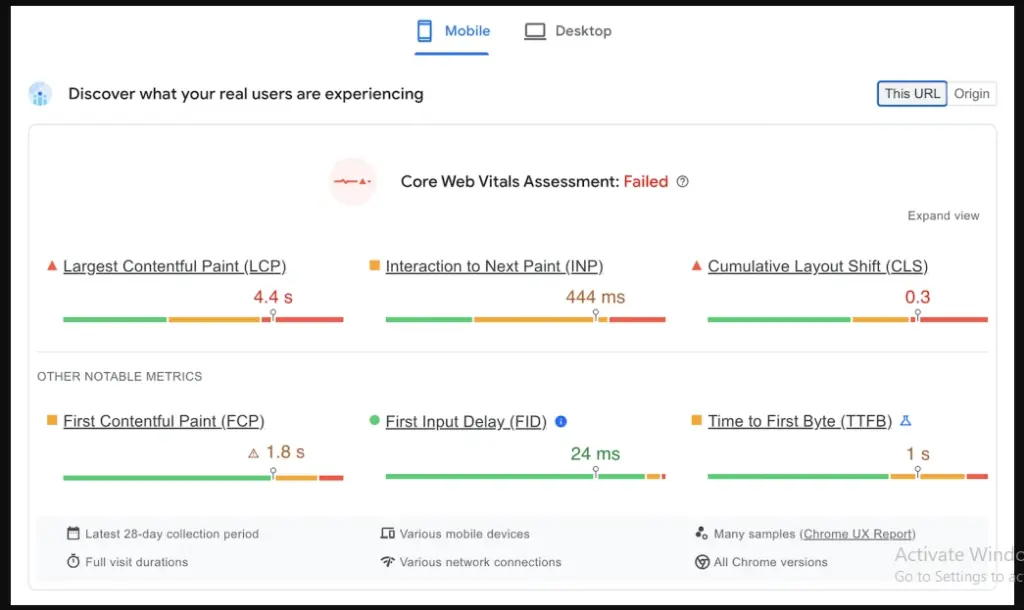
A mobile-friendly website needs to load quickly, respond instantly, and maintain a stable layout. Core Web Vitals directly measure these elements:
- Largest Contentful Paint (LCP) gauges loading performance by tracking how long the largest visible element takes to appear. Faster load times reduce bounce rates and improve user retention.
- First Input Delay (FID) measures responsiveness, analyzing how quickly a page reacts to user interactions like taps and clicks. A delay in response time can create friction, leading to poor engagement.
- Cumulative Layout Shift (CLS) assesses visual stability by identifying unexpected shifts in content, which can frustrate users when buttons or images move unexpectedly.
Google considers these metrics when ranking websites, so optimizing them improves visibility and ensures a superior mobile experience.
How to Optimize
Here’s how you can enhance your website’s mobile performance by improving the three Core Web Vitals.
Improving Largest Contentful Paint (LCP):
- Use next-gen image formats like WebP to reduce file sizes without sacrificing quality.
- Enable lazy loading to delay non-essential content until it’s needed.
- Implement a Content Delivery Network (CDN) to distribute content efficiently and minimize server response times.
Enhancing First Input Delay (FID):
- Minimize JavaScript execution time by reducing unnecessary scripts and optimizing code.
- Limit third-party scripts that slow down user interactions.
- Prioritize loading essential resources first to ensure immediate responsiveness.
Reducing Cumulative Layout Shift (CLS):
- Assign fixed dimensions to images, ads, and dynamic elements to prevent unexpected movement.
- Use CSS properties like font-display: swap to prevent text from disappearing while custom fonts load.
- Maintain a predictable structure to avoid disrupting the user experience.
6. Enhancing User Experience
User experience (UX) defines how smoothly users interact with a mobile site. A well-optimized UX increases engagement, reduces frustration, and improves SEO rankings.
Every element, from page speed to navigation, must contribute to a seamless browsing experience.
Here are three methods that you can use to enhance user experience.
- Responsive Design
- Navigation Optimization
- Interactive Design
1. Responsive Design for Mobile Accessibility
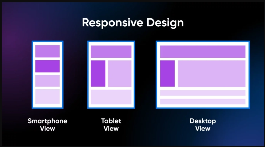
A responsive design ensures a website adapts to different screen sizes without compromising usability. Visitors expect a layout that adjusts dynamically, eliminating the need for zooming or excessive scrolling.
Why It Matters
Users browse across multiple devices, switching from desktops to smartphones. A static design creates friction and forces visitors to leave. Mobile-friendly sites retain users by delivering a consistent experience across all screen sizes.
Let’s explore ways to mobile optimized WordPress websites using these mobile-responsive techniques.
How to Optimize
Here’s how to fine-tune your website for flawless adaptability.
- Use flexible grids to adjust content proportions based on screen dimensions.
- Apply media queries to modify layouts dynamically.
- Test performance across various devices and browsers to identify usability gaps.
2. Navigation Optimization for Small Screens
Limited screen space makes intuitive navigation essential. Visitors should find what they need without frustration. A cluttered interface discourages engagement and increases drop-off rates.
Why It Matters
A clear structure improves accessibility. Visitors navigate smoothly when menus and touch targets are well-placed. Complex layouts lead to confusion and force users to abandon the site.
Let’s explore mobile optimization best practices to make menus and touch interactions seamless on mobile.
How to Optimize
Here’s how you can improve navigation to enhance mobile optimization.
- Design touch targets with a minimum size of 44x44 pixels.
- Maintain proper spacing between interactive elements.
- Implement a fixed header menu for quick access.
- Use a hamburger menu for complex structures.
- Limit main navigation options to 4-8 sections for clarity.
- Adopt a vertical dropdown system for multi-level menus, making scrolling effortless.
3. Interactive Design for Better Engagement
Interactive elements improve engagement by providing immediate feedback and intuitive controls. Modern mobile interfaces rely on subtle animations and touch-based gestures to enhance usability.
Why It Matters
A static website lacks engagement, making it less appealing. Interactive components create a dynamic experience and keep users invested in their journey.
Let’s explore key strategies to make your website more dynamic and engaging.
How to Optimize
Enhance user engagement with subtle yet powerful interactive elements. Here’s how to do it right.
- Introduce micro-interactions that respond to user actions, such as button animations.
- Enable gesture-based navigation, allowing users to swipe, pinch, or zoom.
- Ensure interactive elements enhance usability without distracting from content.
- Choose an eye-candy mobile optimized website template to remain professional and trendy in front of the target audience.
7. Implementing Must-Have Security Practices
A mobile-friendly website is also about security. A site that fails to protect user data loses trust fast. Cyber threats are everywhere, and a single security lapse can cost a business its reputation.
Strengthening security ensures users feel safe interacting with your site, which keeps them coming back.
Why It Matters
Security isn’t just a back-end concern. It directly affects user experience and trust. A mobile site that protects its visitors stays ahead in credibility and rankings. Prioritizing security means safeguarding both your users and your brand.
Let’s look at key ways to fortify your mobile site.
How to Optimize
Here’s how you can enhance security without compromising performance.
SSL Certificates
- Install an SSL certificate from a trusted provider.
- Ensure all website pages, not just the login or checkout, use HTTPS.
- Regularly check SSL validity and renew before expiration.
Frequent Updates
- Enable automatic updates for website software and mobile optimization WordPress plugins.
- Remove unused plugins or themes to reduce security risks.
- Monitor security patches and apply them as soon as they’re released.
Two-factor authentication (2FA)
- Enable 2FA for all admin and user accounts.
- Use authentication apps (Google Authenticator, Authy) instead of SMS for better security.
- Educate users on the importance of enabling 2FA for their accounts.
8. Optimizing Mobile SEO
Mobile SEO refers to optimizing a website to ensure it ranks well in search engine results when accessed from mobile devices. Search engines prioritize mobile-friendly sites because they enhance user experience, making it easier for visitors to navigate and find relevant information.
Why It Matters
Google ranks websites based on mobile usability, meaning a poorly optimized site can lose visibility. A mobile optimized design improves engagement, reduces bounce rates, and enhances discoverability in both text and voice searches.
Websites that follow mobile SEO best practices attract more organic traffic and perform better across search engines.
Let’s explore key strategies to make your site mobile-ready.
How to Optimize
Here’s how you can refine your website to meet mobile SEO standards effectively.
Use Structured Data for Better Search Visibility
- Implement schema markup to help search engines understand content.
- Enable rich snippets to improve how search results display site details.
- Optimize content for voice search by structuring answers to common queries.
9. Enhancing Voice Search and Local SEO
Voice search allows users to perform searches using spoken commands, while local SEO optimizes a website to rank better for location-based searches.
Both strategies improve accessibility and increase traffic from mobile users looking for immediate solutions.
Why They Matter
With voice searches growing rapidly, users expect quick, conversational answers instead of scrolling through pages of results. In fact, nearly 58% of consumers use voice search to find local businesses, and those searches often lead to immediate actions like store visits or purchases.
Ignoring voice and local SEO means missing out on high-intent traffic that’s actively looking for solutions.
Let’s explore ways to capture voice search traffic and turn local queries into conversions.
How to Optimize
Here’s how to refine your approach and stay ahead in search results.
Optimize for Voice Search Queries
- Use conversational keywords that reflect natural speech patterns.
- Structure content with direct and clear answers for featured snippets.
- Format FAQs to match common voice search queries.
Strengthen Local SEO Strategies
- Optimize Google Business Profile (GBP) with accurate business details.
- Use location-based keywords such as “near me” to capture local searches.
- Ensure NAP (Name, Address, Phone) consistency across online directories.
10. Utilizing Google’s Tools
Google and other platforms provide tools to evaluate and enhance mobile site performance. These tools identify mobile speed optimization issues, usability problems, and ranking factors that affect SEO.
Why They Matter
Even the best-designed mobile site can underperform without the right tools. Google and other platforms offer powerful solutions to find speed bottlenecks, fix usability flaws, and refine SEO strategies.
These tools provide data-driven insights to help you enhance performance, boost rankings, and keep users engaged. Ignoring them means operating in the dark while competitors fine-tune their mobile experience.
Let’s explore the tools for mobile optimization best practices that can give your site a competitive edge.
How to Optimize
Here’s how to use these tools to fine-tune your mobile performance.
Use Google’s Mobile Performance Tools
- Google PageSpeed Insights to analyze loading speed and get optimization tips.
- GTmetrix to get detailed performance reports.
- WebPageTest to test website speed under different network conditions.
- Google Search Console to identify mobile usability issues.
Implement Continuous Performance Audits
- Track mobile conversion rates and engagement metrics.
- Analyze bounce rates to detect usability problems.
- Use heatmaps to understand user interactions and optimize layouts.
11. Avoiding Pop-Ups

Pop-ups are small windows that appear over website content to capture user attention. Many businesses use them for lead generation, promotions, and increasing conversions.
These overlays may work effectively on desktop screens. But on mobile devices, they interfere with navigation.
Why Are Pop-ups a Problem in Mobile Optimization?
Pop-ups frustrate users, especially on smaller screens. A single misclick can drive them away.
Google also penalizes websites with intrusive interstitials and lowers their search rankings. Reduced visibility on search engines means lower organic traffic.
How to Optimize Lead Generation without Pop-Ups
Instead of relying on pop-ups, alternative strategies improve user experience while maintaining engagement. Here’s what you can do:
CTA Buttons
- Place CTA buttons in high-visibility areas, such as near the header or after key content.
- Use short, action-driven text like "Get the Guide" or "Subscribe Now" to prompt clicks.
- Keep the button size appropriate for mobile screens to prevent accidental taps.
Slide-in Banners
- Trigger banners after users scroll a certain percentage of the page or stay for a set duration.
- Keep banner size minimal to avoid overwhelming the screen.
- Ensure an easy close option to give users control over their experience.
Lead Magnets
- Provide downloadable resources like eBooks, PDFs, or exclusive newsletters.
- Highlight the benefits clearly to encourage sign-ups.
- Place lead magnet forms at the end of blog posts or within sidebars for better visibility.
12. Optimizing Button Size and Placement
Buttons direct users toward key actions. If they are too small or placed in hard-to-reach areas, users struggle to interact. This leads to frustration and lost conversions.
Why It Matters
A mobile screen limits precision. Users rely on quick taps rather than precise clicks. Small buttons increase errors, reducing efficiency and engagement. So, it becomes very important to optimize the button size and placement to give users a better mobile experience.
Here’s how you can do that.
How to Optimize
Let’s explore ways to make every tap count with buttons that are easy to find, reach, and use.
- Make buttons large enough to tap without zooming.
- Add adequate spacing to prevent accidental clicks.
- Use color shifts, underlines, or animations to indicate interactivity.
- Place essential buttons within natural thumb reach, ideally in the lower center or right for right-handed users.
- Keep primary buttons in the same location across pages to ensure familiarity and improve navigation.
13. Ensuring Emails Are Mobile-Friendly
Over 55% of emails are opened on mobile devices, yet 70% of users delete poorly formatted emails within three seconds. If your emails aren’t optimized for small screens, you’re losing engagement before the message even lands.
Why It Matters
Unreadable emails hurt engagement and cost you leads. Emails with responsive design see a 15% increase in unique clicks, while clear CTAs and easy-to-tap buttons can boost conversions by 42%.
Optimizing for mobile ensures your audience reads, clicks, and acts instead of deleting.
Let’s explore strategies to ensure your emails are clear and clickable on any screen.
How to Optimize
Here’s how to make your emails mobile-friendly and conversion-ready.
- Ensure emails automatically adjust to different screen sizes.
- Use a single-column layout to improve readability on smaller screens.
- Increase font size to eliminate the need for zooming and prevent frustration.
- Replace text links with tap-friendly buttons to boost interaction rates.
- Preview emails on multiple devices to verify proper display and functionality.
14. Ensuring Seamless Cross-Device Compatibility
A mobile-optimized website should provide a consistent experience across all devices. Cross-device compatibility ensures that users can access and navigate your website effortlessly, whether they are using an Android phone, an iPhone, or a tablet with varying screen resolutions.
A seamless experience improves engagement, reduces bounce rates, and contributes to higher conversion rates.
Why It Matters
Consumers expect websites to function smoothly across different devices. A site that appears broken on certain screens or behaves unpredictably on various browsers risks losing potential customers.
Ensuring compatibility across devices enhances user satisfaction, strengthens brand credibility, and improves search rankings.
How to Optimize
- Evaluate your website’s performance on multiple devices and browsers, including Safari, Chrome, and Firefox. Identify inconsistencies in layout, functionality, and loading speeds.
- Implement percentages (%) and viewport width (vw) units instead of fixed pixel values to ensure fluid resizing across screens.
- Combine fluid layout rules with media queries to adjust styles dynamically based on screen dimensions.
- Use flex-direction to manage content flow, justify-content for proper spacing, and align-items for structured alignment within containers.
15. Optimizing for Social Media Engagement
A mobile-friendly website should integrate seamlessly with social media platforms. This makes content easily shareable and drives traffic from social channels.
Why It Matters
Social media plays a very important role in digital marketing. Websites that align with social media trends can increase brand visibility and engagement rates.
Here are the key steps to easily connect your website with social platforms and maximize your reach.
How to Optimize
Let’s go over the steps to align your site with social media trends.
- Integrate social media sharing buttons for effortless content sharing.
- Use mobile-friendly images and headlines that capture attention.
- Leverage social media ads to target mobile users effectively.
- Implement Open Graph and Twitter Card metadata for enhanced social previews.
16. Enhancing Website Accessibility
Ensuring accessibility allows all users (including those with disabilities) to navigate and interact with content effectively.
Why It Matters
A website that accommodates diverse needs encourages a positive user experience and complies with legal requirements in many regions. Accessibility also expands audience reach and contributes to improved SEO rankings.
Let’s explore ways to ensure your site is smooth, inclusive, and frustration-free.
How to Optimize
Here are the key strategies to make your website effortlessly accessible without compromising design or functionality.
- Use semantic HTML to enhance screen reader compatibility.
- Implement ARIA (Accessible Rich Internet Applications) attributes where necessary.
- Provide alternative text for images to aid visually impaired users.
- Enable keyboard navigation for users who cannot use a mouse.
- Ensure proper color contrast to improve readability.
- Use a WCAG compliance checker to verify adherence to accessibility standards.
17. Implementing Mobile-Optimized Forms
Mobile form optimization ensures users can easily fill out and submit forms on their devices without frustration. A well-optimized form reduces drop-offs and enhances conversions.
Why It Matters
Forms are crucial for lead generation, sign-ups, and transactions. However, they can feel tedious on mobile. Poorly designed forms lead to abandoned carts, lost leads, and frustrated users.
A seamless and user-friendly form boosts completion rates and drives better engagement.
Let’s explore the mobile optimization best practices to make your mobile forms user-friendly.
How to Optimize
Smart design choices can make form-filling effortless. Here’s how to get it right:
- Minimize the number of required fields to reduce friction.
- Use appropriate input types (e.g., a number pad for phone numbers and email keyboards for email fields).
- Enable autofill and input suggestions for a faster user experience.
- Provide real-time validation to prevent submission errors and improve accuracy.
Now that we've covered mobile optimization best practices, let’s look at what the future holds.
The Future of Mobile Optimization: What’s Coming and What Actually Matters
Mobile isn't evolving. It's reinventing itself. Faster networks, smarter AI, and changing user behaviors mean what worked last year won't cut it tomorrow. Brands that treat mobile optimization as a checklist are already behind.
Instead, let’s examine where real shifts are occurring and what businesses need to do to remain competitive.
1. Search is changing
We’re in a post-keyword era. Users don’t type robotic phrases like “best coffee shop NYC” anymore. They say:
"Where's a great place to grab a coffee near me that's open late?"
Voice search, AI-driven search, and Google’s Search Generative Experience (SGE) are reshaping rankings. Pages built for rigid keywords will sink. While those optimized for intent, structured data, and context-driven content will rise.
What to do: Focus on natural language, Q&A formatting, and featured snippets.
2. PWAs
Nobody wants to download an app for a one-time purchase. Enter Progressive Web Apps (PWAs), which feel like an app but load via a browser. These are:
- Instant (no waiting for downloads)
- Cross-platform (mobile + desktop)
- Offline-capable (works even with bad internet)
Brands like Starbucks, Uber, and Pinterest have already boosted conversions with PWAs. If your business still relies on heavy mobile websites, you’re losing customers to friction.
What to do: Ditch slow and bloated mobile sites. Consider a PWA for a smoother UX.
3. 5G
Most brands think 5G just means faster loading times. But that’s the bare minimum. What’s actually interesting?
- AR shopping experiences that work in real-time
- 4K and interactive video content without lag
- Cloud gaming & ultra-responsive mobile UX
Retailers can now stream real-time try-on features, media companies can push immersive ad formats, and mobile gaming is entering console-level quality. The businesses that use these new experiences first will set the standard.
What to do: Don’t just optimize for speed. Think what faster speeds enable.
4. Mobile-First Design
A mobile-friendly site isn't enough anymore. The old method that includes designing for desktop, and then shrinking it down for mobile doesn't work anymore. Most users now browse on their phones first.
Mobile-first means:
- Thumb-friendly navigation (because users scroll with one hand)
- Priority on speed & simplicity (because attention spans are shorter)
- Minimalist, clutter-free UX (because screens are small)
What to do: Design for mobile-first, then scale up for desktop, not the other way around.
5. Sustainability
Sustainability isn’t just about eco-conscious branding anymore. It’s becoming a technical SEO factor, a performance booster, and a consumer expectation.
With mobile usage growing, energy-efficient design is moving from a corporate responsibility to a business necessity.
Why?
- Faster-loading sites reduce energy use (Google favors eco-friendly performance)
- Users are demanding greener tech (Gen Z especially values low-energy apps)
What to do: Optimize for lighter pages, fewer animations, and efficient coding. It will be good for both speed and the planet.
Mobile Optimization Best Practices for 2025: A Skimmable Guide
| Best Practice | Description |
| 1. Optimize Performance | Eliminate unnecessary elements, compress assets, and improve data loading to ensure fast access. |
| 2. Write Mobile-Friendly Content | Use clear, concise language and structured content for easy readability on smaller screens. |
| 3. Optimize Visual Content | Use modern image formats and techniques to ensure visuals load efficiently without losing quality. |
| 4. Optimize Video Content | Use efficient formats and adaptive streaming to enhance playback speed and quality. |
| 5. Focus on Core Web Vitals | Improve Largest Contentful Paint (LCP), First Input Delay (FID), and Cumulative Layout Shift (CLS) for better performance. |
| 6. Enhance User Experience | Implement responsive design, optimize navigation, and create interactive elements for engagement. |
| 7. Implement Security Practices | Use SSL, enable automatic updates, and implement two-factor authentication for user safety. |
| 8. Optimize for Mobile SEO | Use structured data and optimize content for voice search to boost visibility. |
| 9. Enhance Voice Search & Local SEO | Focus on conversational keywords and optimize Google Business Profile for local searches. |
| 10. Utilize Google’s Tools | Use tools like PageSpeed Insights and GTmetrix to evaluate and enhance mobile site performance. |
| 11. Avoid Intrusive Pop-Ups | Use alternative engagement strategies, such as CTA buttons and slide-in banners, for better UX. |
| 12. Optimize Button Size & Placement | Ensure buttons are large enough and well-placed for easy interaction on mobile screens. |
| 13. Ensure Mobile-Friendly Emails | Design emails to be responsive and easy to read on mobile devices. |
| 14. Ensure Cross-Device Compatibility | Test performance across devices and browsers for a consistent experience. |
| 15. Optimize for Social Media Engagement | Integrate social sharing buttons and use mobile-friendly visuals to enhance reach. |
| 16. Enhance Website Accessibility | Implement semantic HTML and ARIA attributes for improved accessibility. |
| 17. Optimize Mobile Forms | Design user-friendly forms with minimal fields and real-time validation for better conversions. |
Final Thought: Mobile is the Default, Not an Add-On
Mobile optimization isn’t just about rankings or following trends. It’s about creating an experience so smooth that users never think about it. Brands that adapt to mobile optimization best practices such as AI-driven search, PWAs, AR, and mobile-first design will succeed. The rest? They’ll struggle to keep up.
If you’re looking to give your mobile experience the performance it deserves, FastCow’s managed WordPress hosting can help you do just that. Ensure your site is fast, scalable, and mobile-friendly with a provider that gets it.
Get started with FastCow today, because your website deserves to be as mobile-first as your audience.
FAQs
1. What Are the Common Mistakes to Avoid When Optimizing a Website for Mobile?
Slow load times from large images, lack of caching, tiny fonts, and non-touch-friendly buttons all hurt mobile UX. Prioritize speed, readability, and usability to avoid these pitfalls.
2. How Can I Test if My Website Is Mobile-Friendly?
Use tools like Google Lighthouse, LambdaTest, and Responsive Test Tool to check loading speed, touch responsiveness, and overall mobile performance.
3. Can I Do SEO on Mobile?
Yes, mobile SEO includes optimizing for speed, local searches, and mobile-first indexing to ensure search engines rank your site well for mobile users.
4. How Would You Optimize a Web Application for Mobile Devices?
Use progressive web apps (PWAs), reduce server load with caching, compress assets, and implement touch-friendly UI for smooth mobile interactions.
5. What Are the Best Practices for Mobile Device Security?
Encrypt data, enable multi-factor authentication (MFA), limit app permissions, and regularly update software to prevent cyber threats.
6. What Is the Biggest Challenge in Mobile Optimization Today?
Balancing high performance with rich media content is the biggest challenge. Users expect speed, but they also want interactive and immersive mobile experiences.


