
A coding font is the one piece of your setup you look at for every minute of every working day, and most developers pick one in about ninety seconds and never revisit it. The best coding fonts are not simply the prettiest ones. They are the ones that keep a lowercase l away from a 1, hold their shape at 13px on a cheap monitor, and stay comfortable at hour six rather than minute one.
This guide covers sixteen free coding fonts and five paid ones, each shown in the same four lines of real code so you can compare them honestly rather than reading adjectives. Every specimen below is a rendered image of the actual typeface, not a description of it.
What makes a good coding font
Almost every font here is monospaced, meaning every character occupies the same width. That is not aesthetic preference. It is what makes columns line up, what lets your editor draw an indent guide that means something, and what makes a diff readable. Google’s type glossary has a short, clear explanation of what monospaced actually means if the term is new to you.
Beyond that, five things separate a font you tolerate from one you keep:
- Glyph disambiguation. The zero should be slashed or dotted. The lowercase l, uppercase I and digit 1 should be three obviously different shapes. This is the single most important property and the one people notice last, usually after a wasted hour.
- x-height. Taller lowercase letters read better at small sizes. It is why JetBrains Mono looks comfortable at 13px where a lower x-height font needs 15.
- Punctuation weight. Braces, brackets, semicolons and dots are structural in code and decorative in prose. A good coding font draws them heavier than a text font would.
- A real italic. Most syntax themes use italics for comments. A font with a genuine italic rather than a mechanical slant makes that distinction do actual work.
- Ligature support, optional. Useful to have, not compulsory to use. More on that below.
Free coding fonts versus paid ones
The honest summary is that the free tier won. Ten years ago the paid fonts were clearly better; today the gap is narrow enough that most developers will never feel it. JetBrains, Adobe, IBM, Microsoft, Intel, GitHub and Vercel have all released production-quality monospace families for nothing, most of them under the SIL Open Font License, which lets you use them commercially, embed them in a website and modify them.
What you still buy with a paid font is a particular voice, a wider weight range, and in some cases support and updates. Those are real, but they are refinements. If you are choosing your first serious coding font, start free and stay there until something specific annoys you.
The best free coding fonts
All sixteen below are free for commercial use. Each specimen shows the same four lines: ligature-forming operators, the notorious 0O1lI cluster, a line of real JavaScript and a string with digits.
JetBrains Mono
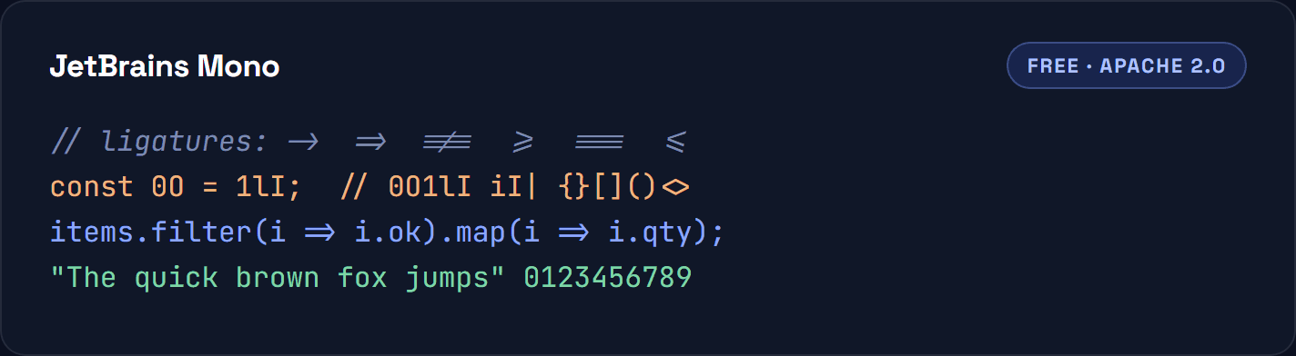
Free, Apache 2.0. Drawn by JetBrains for their own IDEs and now one of the most widely used coding fonts anywhere. The letterforms are slightly taller than average, which buys back readability at small sizes without needing extra line height. Ligatures are included and can be switched off. If you want one safe default and no further thinking, this is it. Download from JetBrains
Fira Code
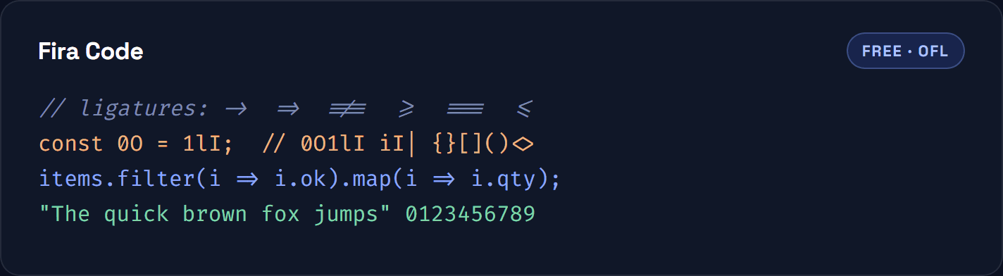
Free, OFL. The font that made programming ligatures mainstream. It extends Mozilla’s Fira Mono with a large ligature set, so !== and => collapse into single symbols. Look at the specimen above and you can see the arrows and comparison operators fuse. You will either love that immediately or turn it off within a day. Fira Code on GitHub
Cascadia Code
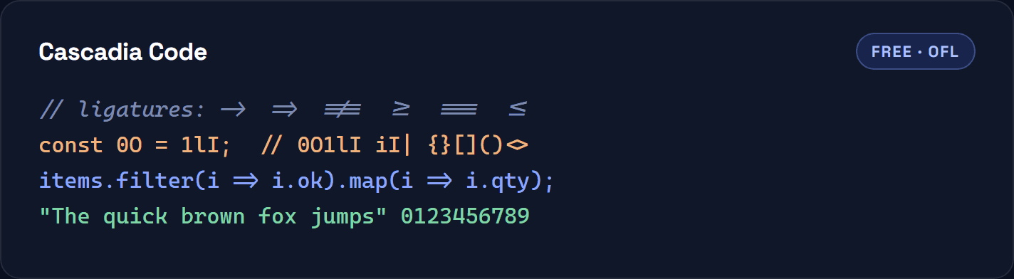
Free, OFL. Microsoft’s font, shipped as the default in Windows Terminal and a common choice in Visual Studio Code. Slightly rounded and friendly for a technical typeface. If you want the same shapes without ligatures, Microsoft publishes Cascadia Mono alongside it, which is the same font with the ligature table removed. Cascadia Code on GitHub
Source Code Pro
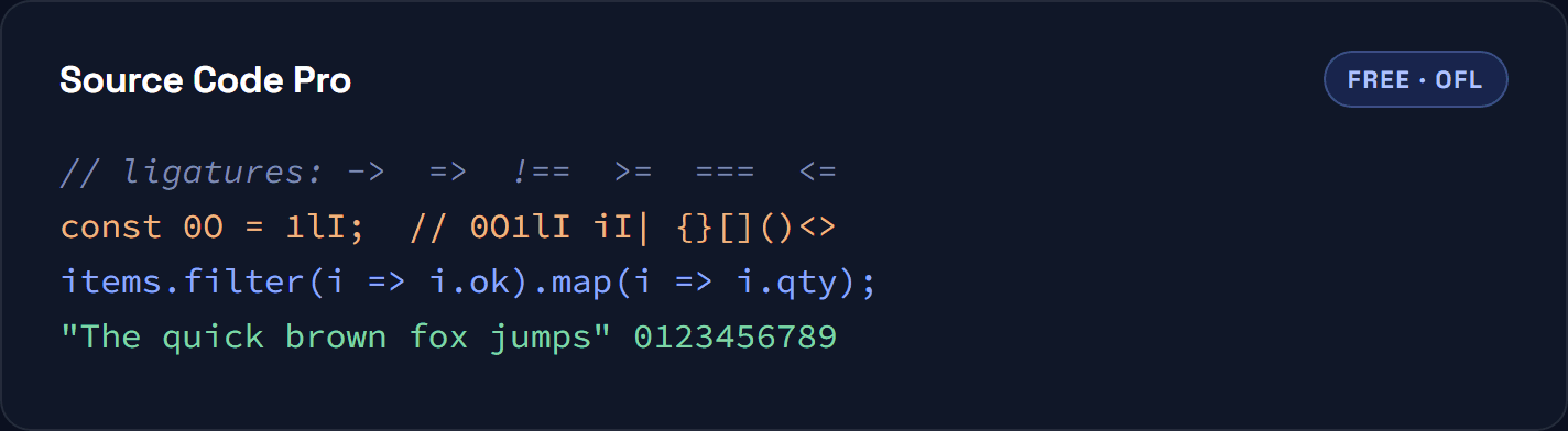
Free, OFL. Adobe’s contribution and the most conservative pick on this list, which is a compliment. Nothing is stylised, the zero is slashed, and the letterforms hold up in screenshots and printed documentation. A good choice for teaching material or anything a stranger has to read at a glance. Source Code Pro on GitHub
IBM Plex Mono
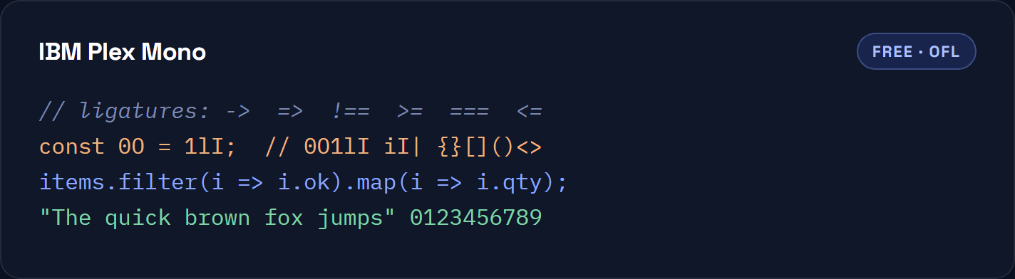
Free, OFL. Part of IBM’s Plex superfamily, so it sits beside Plex Sans and Plex Serif without a clash. That matters more than it sounds: if you write documentation, your code blocks and your body copy finally look like they come from the same place. Warmer and slightly more characterful than Source Code Pro. IBM Plex
Inconsolata
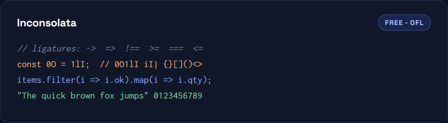
Free, OFL. A narrow humanist face by Raph Levien, and the reason it is still popular after nearly twenty years is width. You fit noticeably more columns on screen before wrapping, which is worth real money on a laptop or in a split editor. No ligatures, and it is all the better for it. Inconsolata on Google Fonts
Roboto Mono
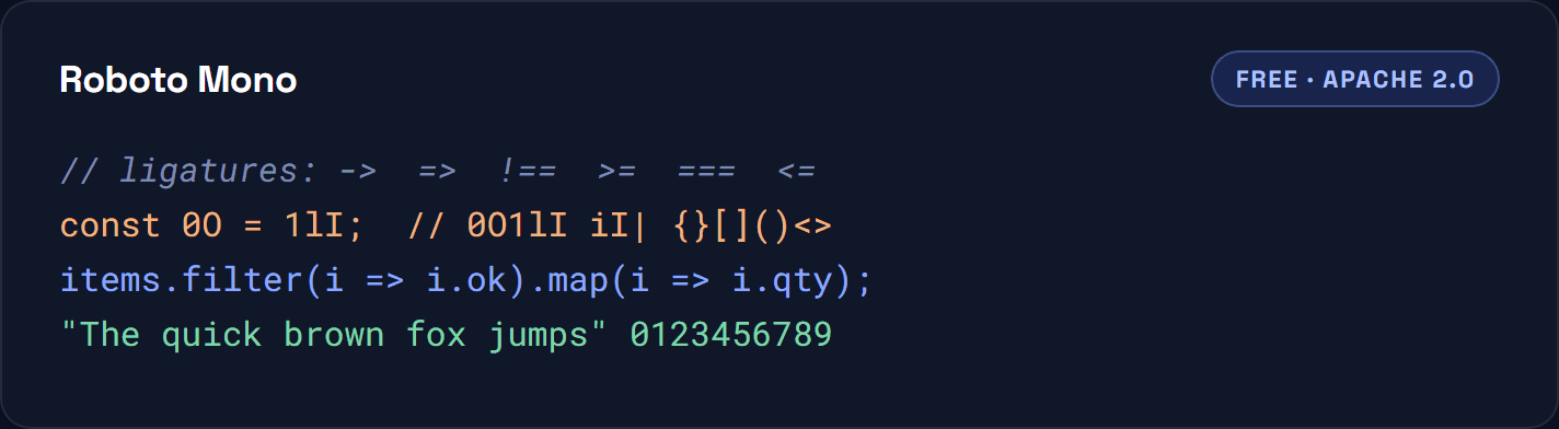
Free, Apache 2.0. The neutral option. Roboto Mono has no opinions, enormous language coverage and weights from thin to bold, which makes it a sensible pick for interfaces and dashboards rather than only for editors. If a font is going in front of users rather than developers, start here. Roboto Mono on Google Fonts
Victor Mono
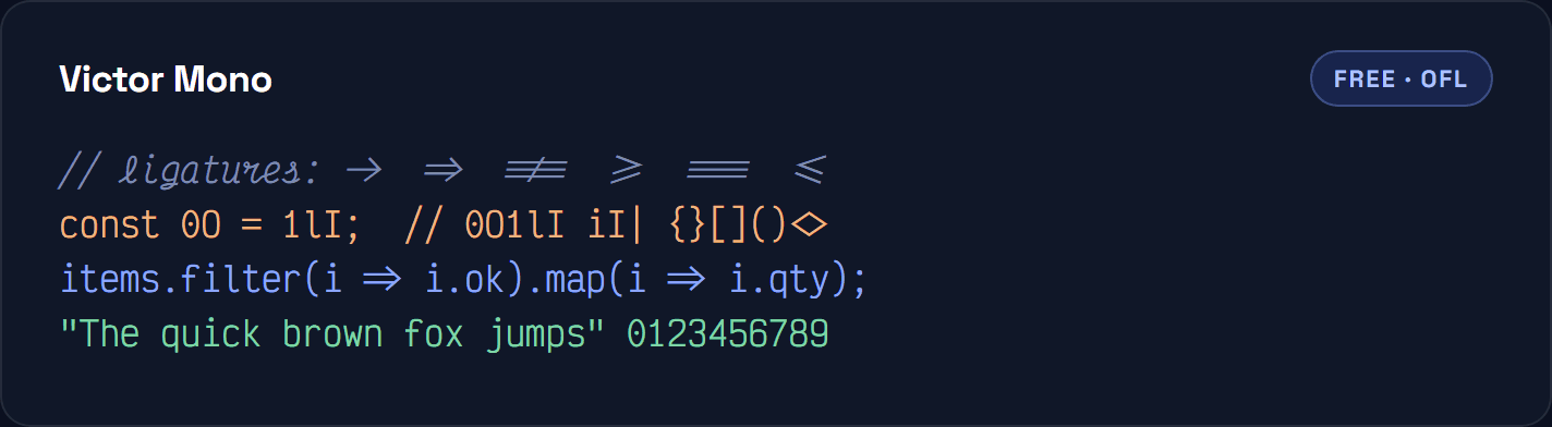
Free, OFL. Chosen almost entirely for one feature: the italic is a true cursive. Comments and keywords render as handwriting, which sounds like a gimmick until you have used it for a week and can pick out prose from code without reading either. You can see it in the comment line above. Victor Mono
Geist Mono
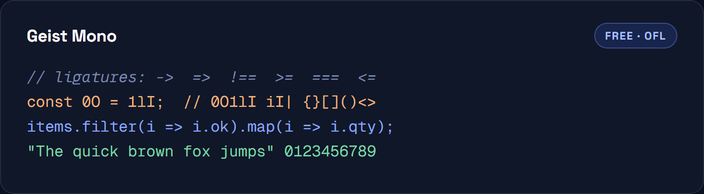
Free, OFL. Vercel’s typeface, and the most contemporary looking font here. Geometric, tight, low contrast, designed to sit inside a modern product UI rather than only in a terminal. Pairs with Geist Sans if you want the matching set. Geist by Vercel
Intel One Mono
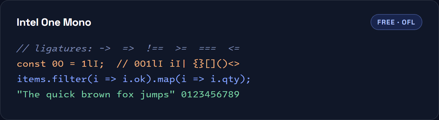
Free, OFL. Commissioned by Intel and developed with input from low-vision developers, which shows in how hard it works to keep similar glyphs apart. If you have ever lost time to a lowercase l masquerading as a 1, this and 0xProto are the two to try first. Intel One Mono on GitHub
Space Mono
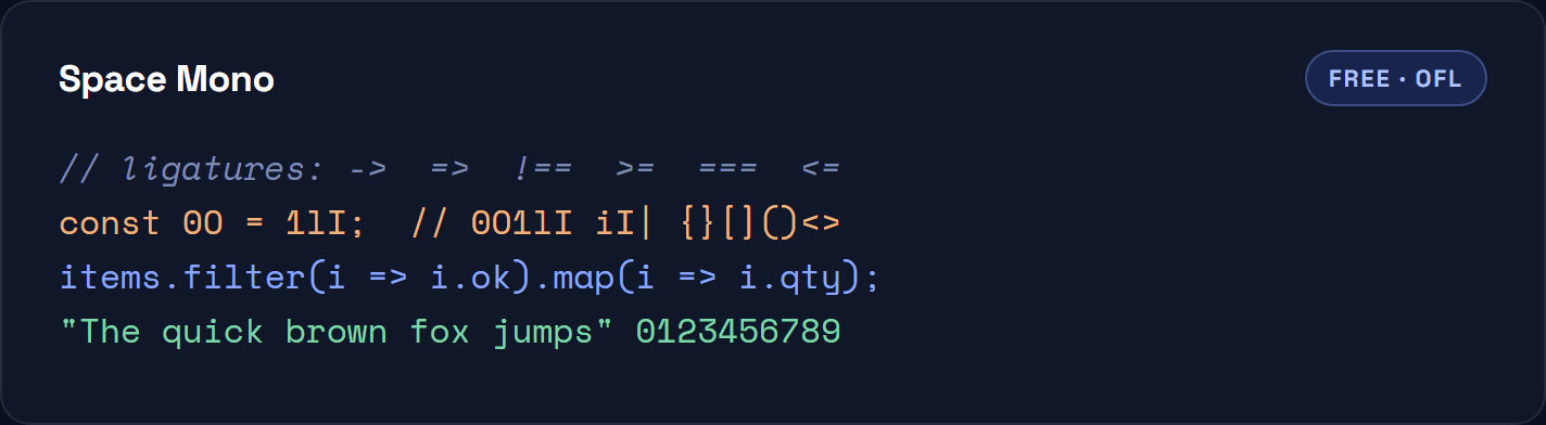
Free, OFL. A retro-futurist display face rather than a workhorse. The quirks that make it excellent in a hero heading or a terminal screenshot are the same quirks that get tiring across a thousand-line file. Use it for headings and code samples on a marketing page, not for your editor. Space Mono on Google Fonts
Recursive Mono
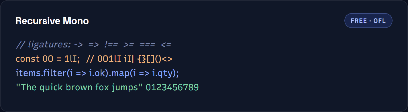
Free, OFL. A variable font with sliders rather than a fixed design. You can move it between monospace and proportional, and between a linear and a casual style, then export the instance you like. Genuinely useful if you are choosing type for a whole product and want the code and the copy to relate. Recursive
Iosevka
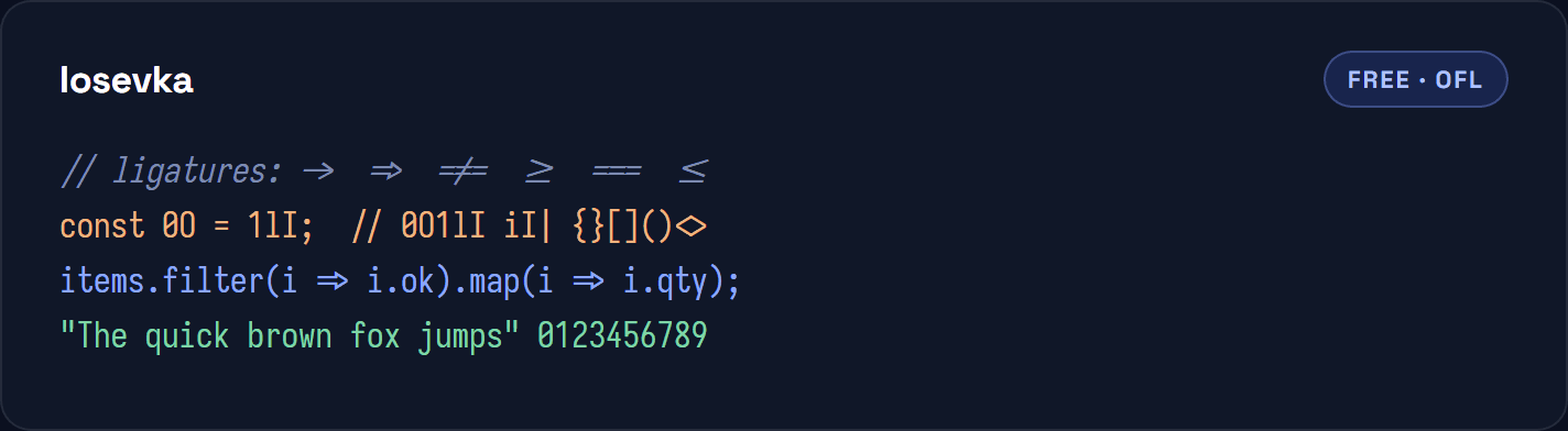
Free, OFL. The narrowest font on this list by some distance, and the most configurable piece of software here as much as the most configurable typeface. You can build your own variant with the glyph shapes you prefer. If you run three files side by side on one monitor, this is what buys you the space. Iosevka
Monaspace Neon
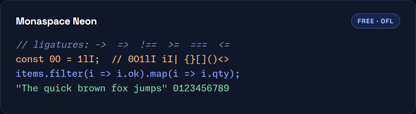
Free, OFL. GitHub released Monaspace as five fonts designed to be mixed in one file, so you can set comments in one voice and code in another and keep the grid intact. Neon is the neutral member of the family. Ligatures ship with it but are not enabled in the build shown above. Monaspace
Commit Mono
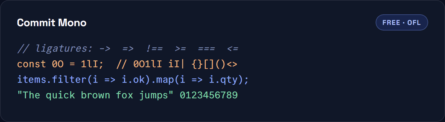
Free, OFL. Deliberately anonymous. The designer’s stated goal was a font with no personality to get in the way, with spacing smoothed out automatically so nothing draws the eye. The site lets you generate a custom build with the alternates you want before you download. Commit Mono
0xProto
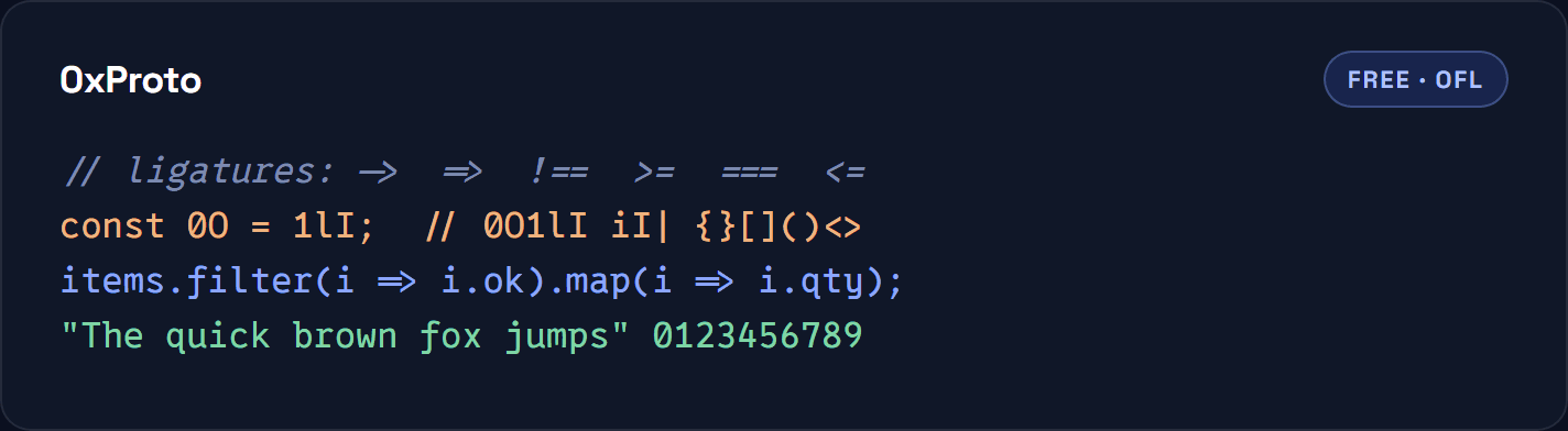
Free, OFL. Built around a single question: which characters do programmers actually confuse? The answers show in the exaggerated differences between similar glyphs and in the unusually clear brackets. A young project compared with the rest of this list, and worth a trial if legibility is your only criterion. 0xProto on GitHub
Shipping a site that has to load as fast as it looks?
FastCow runs LiteSpeed with server-level caching and free Redis on every plan, and our engineers will migrate you across by hand for nothing.
The best paid coding fonts
These have no specimen below, deliberately. We do not hold licences for them, and rendering a preview from an unlicensed copy in order to review it would be a poor way to treat a type designer. Every one offers a trial or a specimen on its own site.
MonoLisa
Paid. The best known commercial coding font, with more than a hundred ligatures, a wide weight range and true italics. There is a free trial, and licences are sold per weight rather than as one bundle, which makes it cheaper to start with two weights than it first appears. The Creator licence was €49 per weight when this was written. View MonoLisa
Berkeley Mono
Paid. A precise, slightly industrial face with a strong following among people who care about terminals. Sold as a one-off licence rather than a subscription. Note the publisher moved from berkeleygraphics.com to usgraphics.com, so older links you find elsewhere will redirect. View Berkeley Mono
Operator Mono
Paid. Hoefler & Co’s design, and the font that started the fashion for cursive italics in code editors that Victor Mono and Dank Mono later made available for free. Expensive, and still the reference point for that look. View Operator Mono
Dank Mono
Paid. A much cheaper route to the cursive-italic look, sold through Gumroad as a single purchase. Rounder and more informal than Operator, with ligatures included. View Dank Mono
PragmataPro
Paid. Extremely condensed, built for people who want the maximum amount of code on screen and are willing to adapt to a distinctive set of letterforms to get it. Sold in tiers depending on how much of the character set you need. View PragmataPro
Prices and licence terms change, so treat any figure here as a starting point and check the vendor before you buy.
Best monospace fonts for coding, compared
One table for the whole list. “Ligatures” means the font ships with them, not that they are switched on by default.
| Font | Cost | Licence | Ligatures | Best for |
|---|---|---|---|---|
| JetBrains Mono | Free | Apache 2.0 | Yes | A safe default for any editor |
| Fira Code | Free | OFL | Yes | People who want ligatures above all |
| Cascadia Code | Free | OFL | Yes | Windows Terminal and VS Code users |
| Source Code Pro | Free | OFL | No | Documentation and screenshots |
| IBM Plex Mono | Free | OFL | No | Pairing code with body copy |
| Inconsolata | Free | OFL | No | Fitting more columns on screen |
| Roboto Mono | Free | Apache 2.0 | No | Interfaces and dashboards |
| Victor Mono | Free | OFL | Yes | Cursive italic comments |
| Geist Mono | Free | OFL | Yes | Modern product UI |
| Intel One Mono | Free | OFL | No | Maximum legibility |
| Space Mono | Free | OFL | No | Headings and marketing pages |
| Recursive Mono | Free | OFL | Yes | Variable, tunable type systems |
| Iosevka | Free | OFL | Yes | Narrow columns, custom builds |
| Monaspace Neon | Free | OFL | Yes | Mixing voices in one file |
| Commit Mono | Free | OFL | Yes | Deliberately neutral text |
| 0xProto | Free | OFL | Yes | Avoiding glyph confusion |
| MonoLisa | Paid | Commercial | Yes | A polished all-rounder |
| Berkeley Mono | Paid | Commercial | Yes | Terminal enthusiasts |
| Operator Mono | Paid | Commercial | No | The original cursive italic |
| Dank Mono | Paid | Commercial | Yes | Cursive italics, cheaper |
| PragmataPro | Paid | Commercial | Yes | Maximum density |
Ligatures: worth it or not
A programming ligature replaces a sequence of characters with a single drawn symbol, so => becomes an arrow and !== becomes a struck equals sign. Compare the Fira Code and Monaspace specimens above and you can see the same line rendered both ways.
The case for them is that operators become shapes you recognise instead of characters you parse. The case against is that the characters on screen no longer match the characters in the file, which matters when you are teaching, pairing, screen-sharing, or counting equals signs in a language where == and === behave differently.
They are a preference, not a best practice. Try a fortnight with them on and a fortnight off. In CSS you control them with font-variant-ligatures; in most editors it is a single setting.
Nerd Fonts and patched variants
If your terminal prompt, file manager or status bar shows boxes where icons should be, you need a patched font rather than a different one. Nerd Fonts takes popular monospace families and adds thousands of glyphs for icons and symbols, then republishes them under the original licence. Most fonts on this list have a Nerd Font build, usually named something like JetBrainsMono Nerd Font.
Install the patched version, point your terminal at it, and keep the unpatched version in your editor if you prefer. There is no downside beyond a larger file.
How to install and set your coding font
Installation is the same as any font. On macOS, open the file and click Install Font. On Windows, right-click and choose Install for all users. On Linux, drop the files into ~/.local/share/fonts and run fc-cache -f.
Then point your editor at it. In VS Code, the setting is editor.fontFamily, with editor.fontLigatures as a separate switch. Give it a stack rather than one name so there is something sensible to fall back on:
"editor.fontFamily": "JetBrains Mono, Menlo, Consolas, monospace",
"editor.fontLigatures": true,
"editor.fontSize": 13.5,
"editor.lineHeight": 1.6
Line height is the setting people forget. Most editors default to something tight, and moving to about 1.6 does more for comfort over a long session than swapping the typeface will. The VS Code settings reference lists the rest.
Do not throw away your system fonts either. SF Mono on macOS, Consolas on Windows and DejaVu Sans Mono on most Linux distributions are all competent, already installed, and licensed for use on that machine. They are just not licensed for you to serve from your own website, which matters for the next section.
Using a monospace font on your website
Everything above concerns your editor. Putting a coding font on a public site is a different problem, because now every visitor downloads it and your Core Web Vitals pay for the privilege.
Three rules keep it cheap:
- Subset it. A code block needs Latin characters, digits and punctuation. Shipping the full glyph set of a font like Iosevka to render forty characters is waste you can measure.
- Use
font-display: swap. Text renders immediately in a fallback and reflows when the font arrives, instead of leaving a blank space. Google’s font best practices covers the trade-offs. - Self-host and preload the one file that matters. Self-hosting removes a third-party connection and puts the file behind your own CDN, where you control the cache headers.
This is also the reason this article ships every specimen as an image. Sixteen live webfonts on one page would have been slower than the thing it is describing, which would be a strange way for a hosting company to make a point about performance. If you are designing the whole site rather than one code block, our guide to winning web design clients covers where typography sits in a pitch.
FAQs
JetBrains Mono is the strongest default. It is free under Apache 2.0, has a tall x-height that stays readable at small sizes, keeps similar glyphs clearly apart and includes optional ligatures. If you want one answer and no further reading, use that. Fira Code is the better pick if ligatures are the reason you are here, and Intel One Mono if legibility matters more than anything else.
JetBrains Mono, Fira Code, Cascadia Code, Source Code Pro, IBM Plex Mono, Inconsolata, Roboto Mono, Victor Mono, Geist Mono, Intel One Mono, Recursive Mono, Iosevka, Monaspace, Commit Mono and 0xProto are all free for commercial use, and most are under the SIL Open Font License. The free tier is genuinely competitive with the paid one now.
Not technically, but almost all are, and for good reason. Equal character widths make indentation, column alignment and diffs readable. A few designers work in proportional fonts, and Recursive can be moved between the two, but monospace remains the default for a practical reason rather than a traditional one.
They are a preference. Ligatures turn operators into recognisable shapes, which many people find faster to read. The cost is that what you see no longer matches the characters in the file, which can mislead during teaching, pairing or code review. Try a couple of weeks each way before deciding.
Between 13px and 15px suits most people on a modern display, with line height around 1.5 to 1.6. Line height is the more neglected setting: increasing it usually improves comfort over a long session more than changing the typeface does.
The fonts released under the SIL Open Font License or Apache 2.0 can be embedded in a website, including a commercial one. Paid fonts need a webfont licence, which is usually sold separately from the desktop licence. System fonts such as SF Mono and Consolas are licensed for use on the machine they came with, not for you to serve from your own server.
Intel One Mono and 0xProto were both designed specifically around legibility and glyph confusion, and Intel One Mono was developed with input from low-vision developers. Source Code Pro is the conservative alternative if you want something less distinctive that still reads cleanly at small sizes.
A patched version of an existing monospace font with thousands of extra icon glyphs added, so terminal prompts and status bars can display symbols instead of empty boxes. It is the same typeface with a larger character set, republished under the original licence.
The short version
Install JetBrains Mono. Set your editor to about 13.5px with a line height near 1.6. Live with it for a fortnight. If the ligatures bother you, turn them off; if you want more of them, move to Fira Code; if you keep misreading characters, try Intel One Mono or 0xProto; if you want the cursive comments, Victor Mono is free and Operator Mono is not.
Then stop. The gap between the best coding font and the third best is far smaller than the time people spend choosing between them, and none of them will make a slow site fast. That part is our job.